Showing posts with label tutorial. Show all posts

Tuesday, 4 February 2020

How to paint the Krieg guardsman

 How to paint Krieg Guardsman


In this short article I will describe those painting recipes that I used when working on the Krieg Guardsman with a flamer. In this miniature, I decided to experiment a little with new colors, slightly modifying old recipes. I hope this shows you that you can and should experiment with paints, try something new.

Saturday, 11 January 2020

Yellow-Black chevrons part 2

Yellow and Black Chevrons, Part 2

In this part, I would like to explain a little more how and why this method of drawing chevrons is used.

Saturday, 28 December 2019

Yellow-Black Chevrons recipe by Ravenswood

Yellow-black chevrons, or stripes, are a fairly simple and interesting way to make a focal point on the miniature or diversify the color scheme. It does not require any special technique or perfect blending to do this element well . On the contrary, some roughness will only improve the result.

For colors, any Golden NMM recipe is suitable for us, in which only the application technique will be changed. We will consciously minimize the contrast.

Wednesday, 5 September 2018

Painting yellow armor (for whom who don't have an airbrush like me)


When painting the Marines Malevolent, I encountered a small problem: the way I paint usually was not suitable for painting yellow armor. Usually I go from dark to light through a lot of layers, but in this case it gave a sad result, since yellow is very difficult to work with. I tried to go from light to dark, but it gave too little depth and color saturation.

In the end, I decided on the method used by a fairly large number of painters: I did a contrasting underpainting and then painted on it.
So, at first, I covered the black undercoat with a layer of Khaki (Vallejo Game Color) [Fig. 1] and then made base mixes for underpainting. For this purpose I used Brown, Dark Tangerine and Yellow from Pacific88 Art-Color.
I divided these mixtures into three parts: for shades the mix of brown + dark tangerine, for lights - dark tangerine + yellow, and something mean for the middle. With the help of these mixtures I made the underpainting [Fig. 2]

The next task was to make the transitions smoother. I started with light areas. For this, I first made a few glazes with a mixture of yellow and dark tangerine made several openings on the borders of the underpainting to blur them. After that, I used pure yellow to brighten the lightest areas, and finally all those openings blurred the boundaries remaining after the highlighting [Fig. 3]

Then I started to use shadows in a similar manner, only using brown and dark tangerine with different proportions for glazing. [Fig. 4]
After smooth transitions, I needed to increase the contrast. To do this, I first made extreme highlights with a mixture of yellow and pearl white (Pacific88 Art-Color), after which I made them glazed by clear yellow, so as not to lose color. And, finally, once again, a mixture of yellow and pearly white, but thinner and more accurate [Fig. 5]

And, finally, I drew additional details of black and battle damage by the brown and a mixture of yellow and pearly white [Fig. 6]
For reference, a color track and used colors are attached. And as bonus for whom who don't have a P88 paints: the alternative variant with more common paints used. It do a little less color depth but looks very similar.


Friday, 24 August 2018

Sigismund's black armor recipe

The time of Friday's painting recipes! I already wrote about my experiments with black on the example of Krieg's engineer (https://serpentarium-painting.blogspot.com/2018/05/paint-it-black.html), but for Sigismund I decided to try something new. I needed a brighter and more contrasting version of black.

The base mix was a mixture of Black (Vallejo Model Color) and Falcon Turquoise (Vallejo Game Color), where I gradually added more Falcon Turquoise.

When the mixture began to go strongly into turquoise, I began to add a first Sky Blue (Pacific88 Art-Color), and then Iraqui Sand (Vallejo Model Color)

Since the armor was painted as "black metallic", that is, according to the principles of the NMM, I took a mixture of black and FT, for reflexes, much more turquoise.

Also, to increase the contrast, I walked through the shadows with a liquid diluted black paint, and also made light glazes Hexed Lichen (Vallejo Game Color).


Friday, 13 July 2018

A quick dark leather recipe


Long time since we had no recipes. There is something to share, but the total lack of free time affects :-(
Here is a small recipe for "leather" products of small size, pouches etc.
Basically now I use browns and oranges from Pacific88 Art Color for this, but now I was asked to do it based on Vallejo / Citadel.

So:
base - black + Dark Fleshtone (Vallejo Game Color)
highlights gradually adding Flat Brown (Vallejo Model Color) to the pure
then Flat Brown highlights with the addition of Skrag Brown (Citadel Layer)
add a very little Scrofulous Brown (VGC) and highlight up using Iraqui Sand (VMC).
At the end, we paint the little lines with a semi-transparent Iraqui Sand.


Monday, 11 June 2018

Traitor Librarian part 5: Burn Fire Burn!


The last part of the Traitor-Librarian project log will be devoted to the fire demon and glow effects.
The first thing that I would like to note is that the fire and all sorts of similar effects are better drawn on a light undercoat. Because I primed miniature with black, I need to do a layer of the light undercoat. I used Khaki (VGC), but in principle, any extra opaque light colors would work.

Thursday, 7 June 2018

Traitor Librarian part 4: Reds


Since I have repeatedly written about working with reds in previous projects, I'll just describe the used colors and techniques. On this model I used two variants of red, warm on a cloak and a tabard and a cold red-magenta on a book and a staff.

Wednesday, 23 May 2018

Traitor Librarian part 3: NMM


Since in the previous project the part with the HMM was fairly well disclosed, I will only allow myself to describe the changes in the recipes regarding the previous variants.

Sunday, 13 May 2018

Paint it Black!

A little bit about painting black on the Engineer of Krieg.

As you know, there has three variations of black tones: warm, cold and conditionally neutral. In this miniature, three versions of cold black were used, their differences should show the difference in the materials that they imitate.

Saturday, 12 May 2018

Traitor Librarian project, part 2 - the Base

This part of the project log will cover painting the base. I was going to make it a bit darker than previous versions, so that the glow from the flame, which I will do later, looked more convincing. Since I have not yet decided what color this flame will be, then I will draw reflexes closer to the end of the project.

Tuesday, 17 April 2018

"Praetor-Tribune" project log, part 6: the lollipop sword

"Praetor-Tribune" project log, part 6: the lollipop sword

In the last part of the project, I will touch on one more important focal point of the our praetor miniature, which is the sword. I decided to do his blade is bright red and very contrast both in light and in color. This scheme is very similar to the one I used when painting crystals on the Demonsmith's base last year, but it has some changes.


Firstly, I finally bought my favorite Basic Red from Andrea Color (and a few more of their colors), which I'm incredibly happy with. And secondly, the shape of the blade forced alternating two variants of red, to achieve greater contrast.

I note that from the point of view of the display light and color on the blade a certain number of errors are allowed. But they are made deliberately to increase the contrast between the surfaces. In addition, after a series of tests, it was decided to abandon the glowing stones on the blade and reduce the OSL effect a minimum (because of which it was half repainted one hand)


The Light. Here everything is standard, as for the previous parts. First I chose the place for the main highlight and made a shadows, midlights, additionals light and reflexes. The most important of which I proceeded - with fracture surface should be strong contrast. This visually emphasizes the shape and along with the color makes the blade of the sword a focal point.

 Colour. When working with the blade, in addition to the contrast of light and shadow, I decided to add a color contrast between the surfaces. The brightest part will be cold red (due to white), the second - a warm yellow-orange. You can notice that one of the surfaces is partially made in one grade, partly in another. In this case, I sacrificed "correctness" for the sake of greater contrast and dramatic effect.


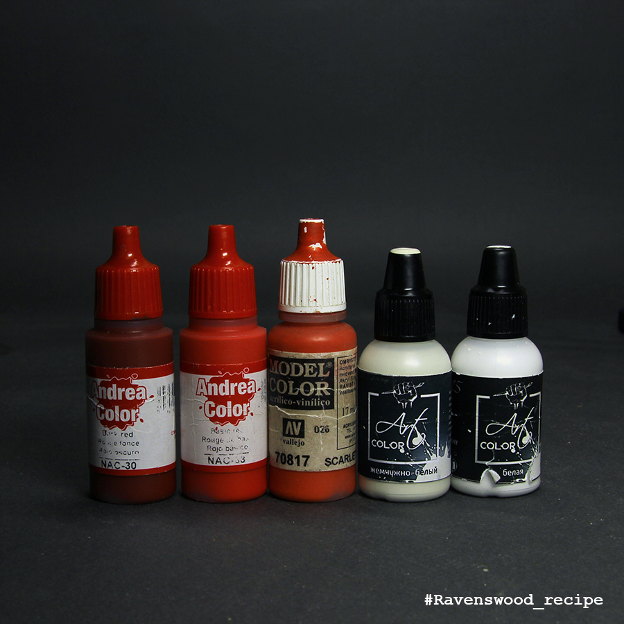
As the base color for the "cold" part, I used Dark Red (Andrea Color) sequentially flashed through pure Basic Red (AC) to Scarlet (VMC). For final highlights and highlights, I used a mixture of Scarlett and Pearl White (P88), which gradually added white. In addition, as far as highlighting, I periodically made Basic Red frosting to keep a cool red tint.
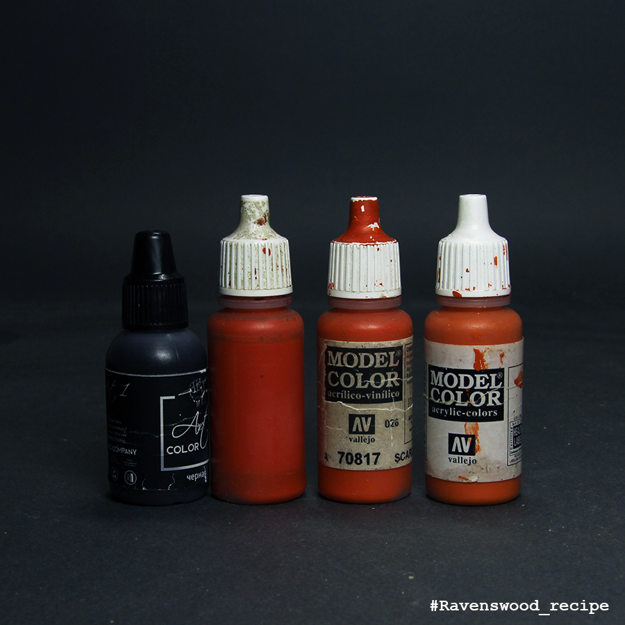
The base color for the warm part was a mixture of black and Dark Vermillion (VMC), which was consistently bleached from the beginning to the pure Dark Vermillion, and then to Scarlet. The final highlightings were made by a mixture of Scarlet and Amarantha Red (both VMCs).
Previous Parts:

Sunday, 8 April 2018

Praetor Tribune Project, part 5: bronze (eng)

Working with this miniature, I wanted to revise my painting experience of the previous Iron Warriors praetor. On that model, there were few surfaces that could be bronze made, so I'd have to make them very bright and contrast so that they stand out. There were much more such surfaces, because of what I decided that this bronze should be "more calm", both in color and in contrast.


Friday, 16 February 2018

A deathguard test model and bone armot recipe

 Before working on Calas Typhon, I decided to do a test miniature from the Death Guard legion to work out a color scheme. Now I already know what and how I want to paint on Typhon, but I also plan to finish this terminator.

A short recipe for painting "bone" armor, what can be useful for painting the Deathwing's terminarors armor or the XIV Legion warriors, for example. Unlike it's previous versions, which I used to paint Kurganova's shock troops armor (from TGG), it has a smaller color depth, but much faster. This was achieved by replacing the Steel Legion Drab (GW) with Khaki (VGC) and avoiding the use of shading with the addition black to base color.
So: base Khaki (VGC) + Iraqui Sand (VMC). Further we highlight to pure IS. Next, highlighting with the addition of white.


Перед начеалом работы над Каласом Тифоном я решил покрасить тестовую миниатюру из легона Гвардии Смерти, чтоб отработать цветовую схему. В принципе, я уже понал чего и как я хочу покрасинь на Тифоне, но все же этого терминатора тоже планирую доделать.
Короткий рецепт для покраски "костяной" брони, корорый может пригодиться для покраски тернинаторов Крыла Смерти или воинов XIV легиона, например. В отличии от своих предыдуших вариантов, которые я использовал для покраски брони Кургановых из TGG, он имеет меньшую глубину цвета, зато значительно быстрее.Это было достигнуто путем замены Steel Legion Drab (GW) на Khaki (VGC) и отказа от использования затемнения с добавлением в базовый цвет черного.
Итак: база Khaki (VGC) + Iraqui Sand (VMC). Дальше высветляем до чистого IS. Дальше высветляем с добавлением белого.


Saturday, 3 February 2018

How to paint Iron Warriors Pretor (ENG)

In this short article, I will describe those painting recipes that I used when working on the limited edition praetor in the colors of the Iron Warriors Legion. I already described some of these recipes, others are published for the first time. On this miniature, I decided to experiment with  new paints, modifying old recipes for paints of other manufacturers. I hope this will show you that with colors you can and need to experiment, constantly changing and improving your style and technique.

Photos of the finished mini you can find here

Как покрасить Претора Железных Воинов (RUS)


В этой небольшой статье я опишу те покрасочные рецепты, которые я использовал при работе над лимитным претором в цветах легиона Железных Воинов. Часть этих рецептов я уже описывал, другие же публикуются впервые. На этой миниатюре я решил поэкспериментировать в новыми красками, модифицируя старые рецепты под краски других производителей. Надеюсь, это покажет вам, что с красками можно и нужно экспериментировать, постоянно изменяя и совершенствуя свои стиль и технику.


Saturday, 6 January 2018

A blue cloth painting recipe

This recipe is dedicated to another variation of blue cloth. This is a slightly modified version of the recipe that we used to paint miniatures for Raging Heroes, adapted for the colors that I have now.
This painting recipe I used to paint the blue clothes on Angel Eyes and Santana Ortega.
As a base color I used mixture of black and Cantabric Blue (Scalecolor), highlight with the addition of slightly more CR is taken. After that, I added a little Falcon Turquoise (VGC) to the mixture, and further highlighting with the addition of Pastel Blue (Pacific88)

Этот рецепт посвящен ещё одной вариации синей ткани. Это немного изменённый вариант того рецепта, которым мы пользовались для прокраски миниатюр для Raging Heroes, подогнанный под те краски, которые сейчас есть в наличии. Последний раз вы могли его видеть на Ангельских глазках и Сантане.
В качестве подложки взята смесь черного и Cantabric Blue (Scalecolor), высветление с добавлением чуть большего количества CR. После этого добавляем в смесь немного Falcon Turquoise (VGC), и далее высветления с добавлением Пастельно-синего (Pacific88)


Saturday, 23 December 2017

Wet Nurse skin tone: step-by-step in pictures

Last winter I painted Kingdom death Wet Nurse and did some pictures while working with it. And forgot about it. A few days ago I found these pics and decided to post it as short step-by-step. Unfortunately I didn't find any records of painting recipes for these pictures (or I didn't write records?). So it will be the only photo. Hope maybe it can be useful for someone.
First part was about semitransparent stockings.
Today it's time for skin tone.
5 steps with layering.
The 6th picture seems a little bit different but it's only because of not the same taking picture conditions. This pic is about lining with purple-red diluted paint.


Sunday, 17 December 2017

Wet Nurse stockings: step-by-step in pictures

Last winter I painted Kingdom death Wet Nurse and did some pictures while working with it. And forgot about it. A few days ago I found these pics and decided to post it as short step-by-step.
Unfortunately I didn't find any records of painting recipes for these pictures (or I didn't write records?). So it will be the only photo. Hope maybe it can be useful for someone.
First part is about semitransparent stockings.


Monday, 23 October 2017

Malifaux Monday #64: Johan's face

 Сегодня вместо новой покрашеной миниатюры я предлагаю вашему вниманию новый гайд, который я сделал для Школы "Мятного Дракона": покраска мужских лиц на примере Йохана из Малифо
Ссылка - https://goo.gl/BZxCqS

Today, instead of a new painted miniature, I offer you a new guide that I made for the  "Mint Dragon's painting school": painting men's faces  based on Johan from Malifaux
Link - https://goo.gl/kXj4dZ