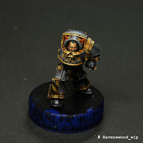
Working with this miniature, I wanted to revise my painting experience of the previous Iron Warriors praetor. On that model, there were few surfaces that could be bronze made, so I'd have to make them very bright and contrast so that they stand out. There were much more such surfaces, because of what I decided that this bronze should be "more calm", both in color and in contrast.
The Light. Before the beginning of work on bronze, I mentally divided the miniature into three levels of illumination: the high level included the shoulder pads and the torso, medium - the belt and the legs to the knees, to the low-the lower part of the leg armor. I needed to divide these parts according to the illumination to create a focal point near the head of the praetor. In addition, this would distribute the lighting at a remote light source.
You can notice that in the part with low illumination, there are almost no bright spots, and those that are not as bright as in other parts. In addition, in the part with low illumination, the shadows are much darker, while the midlight are shorter.
In the middle part bright patches of light appear, and somу surfaces become more contrasting and more elaborate from the point of view of midlights.
In a part with a high level of illumination, the surface of most highlighted area is much larger than in the middle part. In addition, I added a lot of additional sparks in the form of thin, bright lines on the most illuminated and enlongered areas, which is especially noticeable on the shoulder pads.
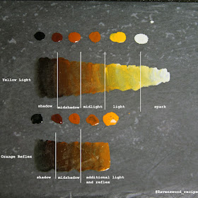
The Colour. As already described above, I tried to make this version of bronze a little less contrast and not so bright orange. To do this, I replaced the "Dark Tangerine" and "Brown", "Orange" and "Brown Ochre" (all the colors here and further on Pacific88 Art Color) as the main colors, leaving them for auxiliary purposes. As a result, I got two color gradients: the main "Black" + "Dark Red-Brown", "Brown", "Brown Ochre", "Orange", "Pearl White" and auxiliary Black "+" Dark Red-Brown " , "Brown", "Dark Tangerine".
During painting it was very important to balance the more yellow main gradient in the lightest areas and orange reflexes. In addition, the closer to the most illuminated areas, the larger the flat occupies the main (yellow) gradient. In addition I actively used glazes with the high diluted "Orange" and "Dark Tangerine" to bring the effect that I conceived.


No comments:
Post a Comment